Adaptation

Filmmaker Peter Jackson wowed me as a teenager with his Lord of The Rings Trilogy in the early aughts. He took massive books that I knew well and loved deeply, majorly condensed them, added a bunch of crazy action scenes and confounding character changes, and still somehow won my heart and made what I felt were good adaptations that captured both the basic plot and the spirit of Tolkien’s three books. Now Jackson is back at it with The Hobbit, the prequel to his trilogy and what I thought would be an easy adaptation for him to get right. But I was very wrong.
The Hobbit: An Unexpected Journey, one of three films that will attempt to trisect J. R. R. Tolkien’s rather short novel into three separate narrative structures, is a poor adaptation that at times can be a good one. It’s both because what it gets right, it gets fairly right, and what it gets wrong is an unholy mess. Jackson nails early scenes from the book, adding a bit of low-brow slapstick and long-winded narration but still hitting the spirit dead on as Bilbo Baggins faces a bewildering barrage of Dwarves and learns of an adventure. It’s when Bilbo begins this adventure that the narrative madness also begins.
What, based on the book, should have been a fairly sedate journey for our heroes from the Shire to Rivendell, stopping for a minor scuffle with some half-wit trolls, becomes a crazy jumble of random CG villains and mixed up lore. Jackson lifts characters from other time-lines, plot points from other books, and mashes them together into what was once a fairly simple part of the tale. What should have been a simplistic, character-driven road movie becomes a drawn out Middle Earth history lesson by a drunken and seemingly uneducated professor who keeps smashing his handmade fan fiction toys into each other and making exploding sounds. This from our mostly eloquent Bard of the Rings. A sad shame.
Image

I was angry when I left the theater; I swore under my breath, I went home and shouted mean things about Peter Jackson to anyone who cared to listen. Then I thought about the film for a few weeks, and its images kept crawling back into my head: goblins on monster wolves fighting dwarves on a cliff in flames, a massive Dwarven city all green and blocky and massed with gold and glowing, a ridiculously frenetic fight and flight sequence along precarious walkways over bottomless pits that culminates in a crazy, exploding descent into utter slapstick, an extremely over-sized Goblin King with a strange lilting voice and a horrible chin who bursts out of nowhere like a Loony Tunes character and says very uncharacteristic things for a creature of his ilk. All these images kept crowding back in to my mind and demanding to be appreciated.
Sure, the city looked a bit goofy and more like something from the World of Warcraft than the world of Tolkien, the wolves were too big and too CG-y, the final fight scene was pretty much non-existent in the book, the Goblin King’s physiology just made no sense whatsoever, and the tumble through the goblin caverns looked more like a side-scrolling video game than an actual sequence of events. One can compare it to Jackson’s earlier action sequences: the T-Rex vine fight in King Kong, the Mines of Moria stairway sequence in Fellowship of the Ring, and it comes up incredibly lacking. But the image sticks, and it all somehow works.
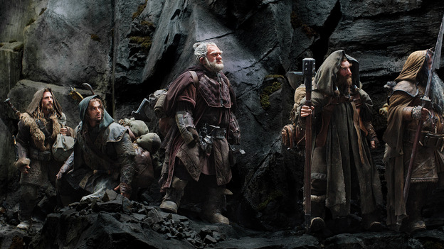
The Dwarves were way over-designed. In the book they wear simple hoods and robes. In the film they look like something out of a steam-punk manga, all begoggled and braided and carrying the oddest assortment of bizarrely shaped axes and clubs imaginable, and yet, they made a deep impression in my mind, and somehow they worked. They looked nothing like the Dwarves I loved, but they still felt like them.
The same goes for almost every design and image in Jackson’s newest film. He seems to have hit on a new aesthetic apart from the faded realism of his earlier films: a hyper-real, cartoon-esque visual quality that defies expectation yet drives home to nest in its viewers brains for days, if not weeks or months. I’ve said nothing of Radagast, a rather dull bit player in The Fellowship of the Rings novel that just explodes out of the woodwork here and dances crazy capers all over any sort of continuity or logic. Jackson’s choice to not only cram him into a different book, but also to transform him a into a sort of mad hatter drove me almost mad. But yet, the visual worked in the context of Jacksons crazy version of Tolkien’s tale, and I admit that I can’t seem to get his image out of my mind either. I’m excited to see part two, even though it promises more of the same, and for all its flaws I want to see part one again, simply to soak in the images.
In the end, I think Jackson, for all his storytelling foibles, still wins. He captured our hearts with his fairly conservative Rings trilogy, and now he’s taking us for a mad, rude dash through his demented version of Tolkien’s once noble and elegant world. He’s letting image trump adaptation, and letting it take the story wherever it leads, and it’s an undeniably fun ride. I’m going to whine and complain all the way, but I think I’m still going to enjoy myself, if just a little.
